“Color! What a deep and mysterious language, the language of dreams.”
Paul Gauguin
Colors
This is the most interesting topic in Elements of Design. Colors are the property of lights, caused by lights. When light hits a surface and then reflects our eye, we see the color of the surface. The black surface absorbs all wavelengths of light so we see black. As the white surface does not absorb any light so we can see all seven colors better on the white surface.
White light consists of seven colors which can be proved by passing white light through a prism. The white light will be separated by wavelength and form a spectrum. The colors are Orange, Red, Violet, Indigo, Blue, Green, and Yellow. Red is the fastest because it has the longest wavelength, while violet travels slowly, and has the shortest wavelength.
Colors are probably the only element of Fashion that can express emotions beautifully. It creates the first impression of clothes. In addition, it creates an instant reaction of liking or disliking, you may choose clothes based on color before checking their fabric or shape. Colors are the dominant characteristics of shape, texture, and form. Colors do not have any physical substances, it is a visual experience.
Colors can create immediate attraction, Colors evoke emotions.
I’m Saying that..
To know more about Colors...
1. The Secret Lives of Color.
Every color has some character. Like every human being. Deep dive into lives of colors!
2. Interaction of Color.
Do you behave the same with all your classmates as you do with your close friends? No. Same for colors.
3. Living with Color.
Get knowledge on color theories and how to apply them to your life.
4. Color Me Beautiful.
Summer, Autumn, Spring, Winter, and different season brings different color palates to our mind. Explore what season you are!
Color-Wheel

A wheel where all the colors of VIBGYOR are organized in a circle is called a color wheel, it is the base of color theory. Clockwise, from 12 o’clock to 11 o’clock, the colors are Red, Rose, Magenta, Violet, Blue, Azure, Cyan, Spring-Green, Green, Chartreuse-Green, Yellow, and Orange. Isaac Newton invented the color wheel in 1666. In Fashion Design it is used for color matching, which color will look good with which color, etc. Colors look good with each other called color Harmony. Two types of color wheels are RYB and RGB. RYB means red, yellow, and blue, whereas RGB means red, green, and blue. RYB is used by artists, as you may know in drawing three primary colors red, yellow, and blue. But for online uses like web designing, we mainly use RGB colors.
- The Primary colors here are Red, Blue, and Green at 12 o’clock, 4 o’clock, and 8 o’clock. If primary colors are mixed it will create pure white color.
- The Secondary colors are the result of two mixed primary colors. So If we mix Red and Blue then we’ll get the Magenta color at 2 o’clock. Red and green will make Yellow at 10 o’clock. Green and Blue will make Cyan at 6 o’clock.
- The Tertiary colors are made by mixing a Secondary color with a Primary color. These colors are Rose (Red+Magenta), Violet (Magenta+Blue), Azure (Blue+Cyan), Spring-Green (Cyan+Green), Chartreuse-Green (Green+Yellow), and Orange (Yellow+Red).
To know more about Colors...
1. The Secret Lives of Color.
Every color has some character. Like every human being. Deep dive into lives of colors!
2. Interaction of Color.
Do you behave the same with all your classmates as you do with your close friends? No. Same for colors.
3. Living with Color.
Get knowledge on color theories and how to apply them to your life.
4. Color Me Beautiful.
Summer, Autumn, Spring, Winter, and different season brings different color palates to our mind. Explore what season you are!
Color Harmony
We know that certain groups of colors look good together while others do not. It is important to understand the relations and interaction between colors of different shades and different values. Color harmony is a pleasing effect of more than one color together. To make a great color combination we’ll look at different combination methods or rules next.
Color Combinations
When we are making a design there are many combination rules we can use in our design accordingly, let’s see what are those..!
Complementary
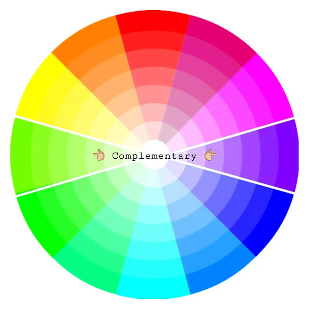
Two colors that are located exactly opposite of each other in the color wheel are called Complementary colors. Here I have chosen Chartreuse-Green and Violet as complementary colors. These colors create the highest contrast and brightest appearance.
Monochromatic
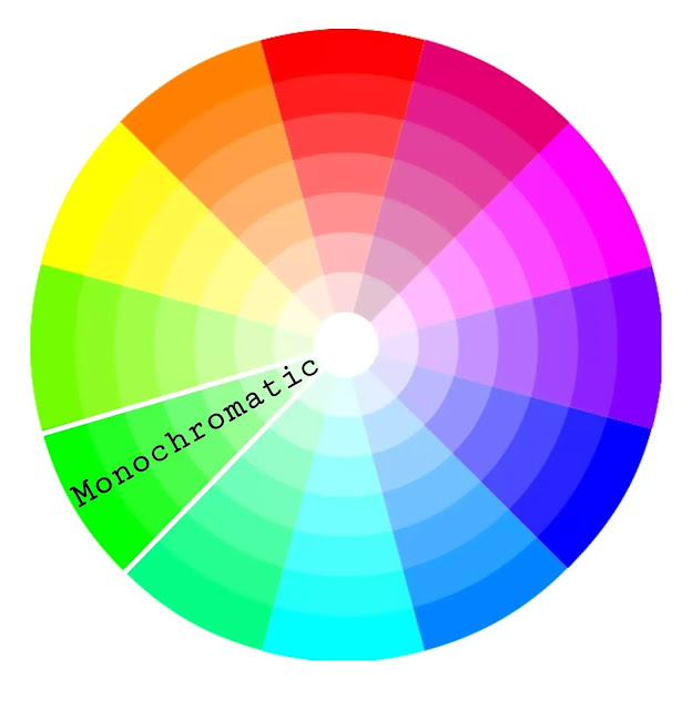
A Monochromatic color contains all tints, tones, and shades of a particular hue. This can be used in different saturation levels which means all colors from lighter shades to darker for a single color. Here in the above picture, I have chosen Green as a Monochromatic color. This looks more subtle and classic. This is an easy and multipurpose combination to apply in a design.
Analogous
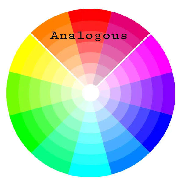
Any three colors organized together in a color wheel are called an Analogous color combination. Here I have chosen Orange, Red, and Rose as Analogous colors. In three colors any one color dominates the other two colors in a design and makes a balance.
Triadic
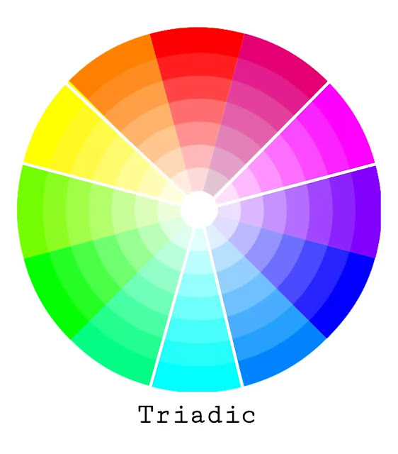
Any three colors in the gap of three colors in between each are Triadic combinations. Here I have chosen Yellow, Magenta, and Cyan as a Triadic color combination. This color combination provides high contrast and a bright more prominent appearance with each other.
Tetradic

Any four colors, each color in the gap of two colors is called a Tetradic color combination. These colors are also great for a bright appearance. But, for the balance of colors in a design, you need to choose one dominant color and the other three as accent colors.
Color Tone: Cool and Warm
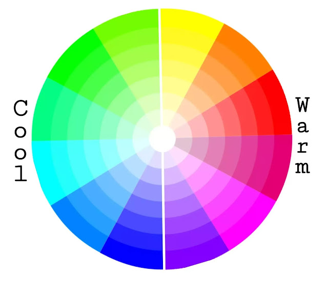
Each color has warm, neutral, and cool tones. This does not mean every tone of Yellow is warm or not every tone of Green is a cool tone. But in the color wheel, the colors Yellow, Orange, Red, Rose, Magenta, and Violet are the warm tones; Chartreuse Green, Green, Spring-Green, Cyan, Azure, and Blue are the cool tones. Having deep knowledge about tones is so important in Fashion Design. A matching tone with the skin undertone looks much better.
To know more about Colors...
1. The Secret Lives of Color.
Every color has some character. Like every human being. Deep dive into lives of colors!
2. Interaction of Color.
Do you behave the same with all your classmates as you do with your close friends? No. Same for colors.
3. Living with Color.
Get knowledge on color theories and how to apply them to your life.
4. Color Me Beautiful.
Summer, Autumn, Spring, Winter, and different season brings different color palates to our mind. Explore what season you are!
But, how do we decide which color is what, right? Try to understand color temperature. Imagine you’re surrounded by colors Red, Orange, or Magenta. Do you feel cold or hot? Now imagine yourself surrounded by blue, and dark green colors. Have you just felt a cold? Exactly. This is how I try to understand color tones. Our feelings of coldness and warmth may not be accurate all the time, but they will be right most of the time. And the more you study colors the more you will be accurate. Warm colors will bring joy, mood uplifting, and energy lifting bright colors whereas cool colors are calming, peaceful, and relaxing.
Hue, Saturation & Value

Hue
It is the all-color shade in a color wheel from Red to Orange clockwise. It denotes a specific wavelength of light.
Saturation:
Saturation is the Intensity or Chroma of the color. How deep or how much color has in a particular shade. Unsaturated colors or low-saturated colors are called muted tones.
Value
Value is the Luminance or presence of light or darkness that is in Brightness in a particular color. Adding light to color gives high-value color whereas adding dark to color gives low-value color. For example, the addition of white to Blue turns it into Lavender Blue, which is a high-value color, and adding black to Blue turns it into Royal Blue which is a low-value color.
Shades, Tints & Tones
Shades
A Shade is adding different amounts of black to a particular hue to create deeper and richer colors. Shades are overpowering.
Tones
Tones are created by adding different amounts of grey hue with a particular hue. Tones are pastel colors.
Tints
Opposite of a Shade, adding different amounts of white to a particular hue to create lighter, less intense colors.
Here’s How to Remember >
- Shade (Hue+Whites), Tones (Hue + Greys), Tints (Hue + Blacks).
To know more about Colors...
1. The Secret Lives of Color.
Every color has some character. Like every human being. Deep dive into lives of colors!
2. Interaction of Color.
Do you behave the same with all your classmates as you do with your close friends? No. Same for colors.
3. Living with Color.
Get knowledge on color theories and how to apply them to your life.
4. Color Me Beautiful.
Summer, Autumn, Spring, Winter, and different season brings different color palates to our mind. Explore what season you are!


1 Comment. Leave new
It contains lot of information
Go on