Elements of design are what we need for a design and principles or design are the rules we need to follow to make a proper design. It is not that easy to create beautiful designs on a craze!
What are Principals of Design?
Principles are the guidances, and paths, to say how to use elements of designs. From paintings through website designing to Fashion we need rules to make these eye-catching. Principles establish the links between elements of design and arrange their allocation within a fabric or layout. Fashion is very subjective but still, our goal is to create aesthetic and pleasing garments not to mess up a design, right? Let’s see what are those basic five principles!
1. Balance
Balance is stability or steadiness from different visual angles within a composition. Some elements should attract the eye while others create a delicate equilibrium. The distribution of elements: colors, texture, and spaces should be properly placed. We will know about three main ways to balance a design.
a. Symmetrical Balance
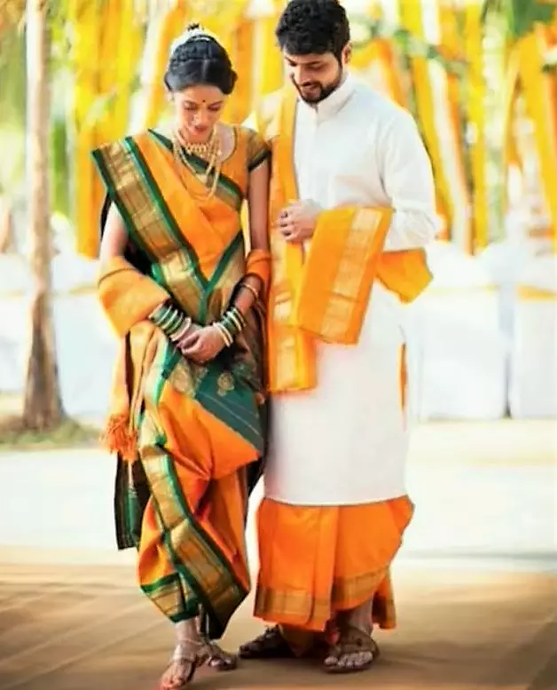
Symmetrical Balance is the basic easy way to balance out a project. It is the mirror balance and uses an imaginary vertical or horizontal line. This means the left side will be almost or exactly the same as the right side, or the upper portion can be equal to the lower portion. In the above picture, we are seeing a vertically symmetrical picture.

b. Asymmetrical Balance
To create an Asymmetrical balance in a composition you need more expert hands. When elements in a design are not equal on each side, or not identical but arranged in a way that creates a sense of balance is called Asymmetrical Balance. In this case, the heaviness of the right side is balanced by the vase on the left side at the back.

c. Radial Balance
When the Elements scatter or radiate from the center point of a design is called Radial Balance. Here you may notice different colors, and shadows on each side, still, when you look at it, the design will be perfectly balanced as shown in the above picture. Other examples are flowers, Rays coming from us, etc.

Various Ways to Balance a Design:
So, as we have seen, an asymmetrical design also needs to be balanced. Here are various ways we can balance an asymmetrical design, check those ⏬
Position:
If there are elements of different sizes we need to put larger elements on one side and multiple smaller elements on another side.
Color:
Suppose, Elements of a design are various in colors. You need to use vibrant colors with soft colors or you may you vibrant colors as the accent colors.
Eye-Direction:
Colors and Positions of the elements should be in the way to lead the eye in a direction or attract the eye. For example, the use of vibrant colors on each side will attract the eye to see the whole design. Or touch of the same color a little bit on another side will also lead the eye from one side to another side.
2. Proportion
Proportion is the representation of two or more elements in a design based on their size, distance, and scale. Based on mathematical ratio Golden ratio was found. This tells that a particular ratio is 1:1.618 is found in nature as well as in the human body. This Golden ratio can be applied in geometric shapes through that ratio and by making a logarithm spiral known as Golden Spiral.

Simply proportion is to understanding how to use size. For example, if you are reading this blogpost you probably do not need to read all the topics nut Proportion. For better understanding, I make all the Headings Bigger and Bolder than others so you can find them easily. The same goes for painting. If you want to draw far and near items, you need to make far items in smaller sizes than nearer objects. In Fashion, you need to maintain proportion as per figure.
3. Emphasis
Does the white flower in the below picture attract your attention? Well, that’s the power of Emphasis. To grab viewers’ attention on a certain point of a whole design we use Emphasis Principle.

It is a focal point in a design, it must be made strongly visible. Of course, for balance or rhythm, our sight will move slowly, but it will always return to the focal point of Emphasis. Emphasis can be implemented by different colors, contrast, placements, shape, asymmetrical elements, isolation, or even size.
Dominance and Subordination are the two important angles of Emphasis.

- Dominance: Black lines are thin but dominating lines in that Mondrian dress right? Dominance creates attractions in a design. Sharp lines, thick lines, shiny textures, and brighter colors always dominate soft lines, thin lines, matte textures, and muted colors accordingly.
- Subordination: But as always, we feel good because of the existence of bad, subordinates minimize the tone down of other elements in a design. Just like the opposite of Dominating elements, matte textures, muted colors, and soft edges helps to move the sight to the focal point of a design.
4. Rhythm

Rhythm is the repetition, progression, or radiation of patterns. Changes in Hue, Chroma, or color in a noticeable pattern are a rhythm. It is the continuity that smoothly guides the eye from one detail to another in a design. Unlike Emphasis, rhythm moves the attention from one point to another point in a design.
Rhythm can be achieved in mainly three ways, Let’s look…
a. Repetition

The repeat of the same elements like pattern, colors, texture, lines, and shapes can make a rhythm in a design. If you look at the above image you’ll see the same pattern of fringe coming down from both sides of the skirt. Repetition can be Regular or Irregular. In Irregular repetition, the repetition of elements will not have specific intervals. It is also called Random Rhythm.
b. Gradation

Gradation focuses attention on the gradual changes of elements in a design. It can be line, space, or color. Gradation of lines can be thick to thin, sharp to soft; Gradation in colors can be dark to light, warm to cool tone. Gradation guides the eye to move along the whole design which is the main point of Rhythm. It is also called Progressive rhythm.
c. Radiation

Radiation is the arrangement of elements and spaces in a design around a central point. It will look like all the elements are radiating outwards from that central point. The hat in the above picture is a perfect example of Radiation Rhythm.
5. Harmony

Keeping all those things in mind while designing, Harmony is the last but not least thing we need to follow to enhance visual satisfaction. The Harmony Principle involves careful combinations of all the elements such as contrast colors, shapes, patterns, lines, textures, etc. Here in the above picture, the dress is decorated with patterns or probably embroidered but keeping that in a single color white is creating a perfect Harmony.
That's all for today! I hope you liked it, leaving a comment will encourage me to write more (❁´◡`❁)
2 Comments. Leave new
Good to know main five principals
My pleasure